
The NBA’s Orlando Magic looked to the past for inspiration for its rebrand. The team, which Forbes valued last year at $3.2 billion, unveiled a new logo, wordmarks, uniforms, and court this week, and the new look is a contemporary take on the team’s original uniforms from 1989 to 2000.
It was a time when players like Shaquille O’Neal and Penny Hardaway wore pinstripes and the team made one of its two franchise appearances in the league finals. It’s also a fan-favorite era.
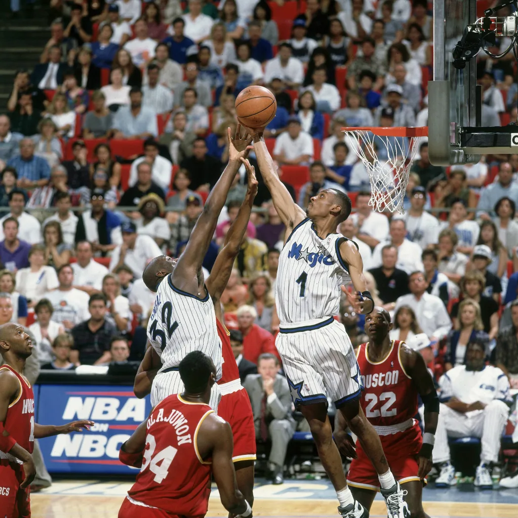 Shaquille O’Neal (No. 32) and Penny Hardaway (No. 1) in action versus the Houston Rockets at Orlando Arena in 1995 [Photo: John W. McDonough/Sports Illustrated via Getty Images]
“We heard from the fans loud and clear over many years about bold pinstripes,” Shelly Wilkes, EVP of marketing and social responsibility for the Magic, told In the Zone on iHeart Radio. “People have such passion around our original uniforms.”
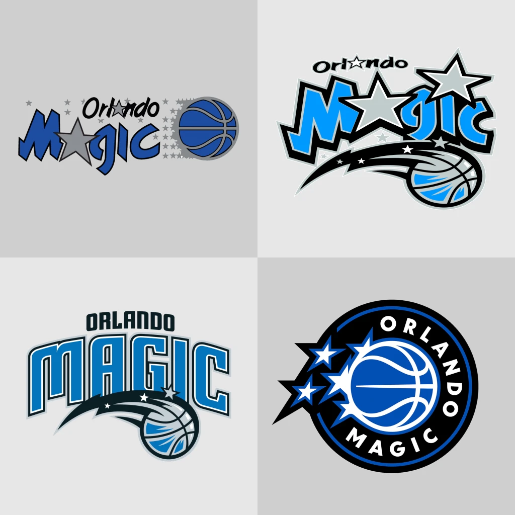 Orlando Magic’s logo progression through the years. Top, from left: 1989-2000 and 2001-2010; bottom, from left: 2011-2025 and the brand-new design unveiled this week [Images: Orlando Magic]
Nostalgia sells in pro sports. The Toronto Raptors recently brought back its old Raptor mascot for a special 30th-edition logo, while in other leagues, teams like the MLB’s Milwaukee Brewers and the NFL’s New York Jets introduced their own retro-inspired logos in recent years because of the built-in brand equity from a team’s golden age. Team rebrands don’t always land, and iterating on well-known, beloved assets is a safer bet than trying something new.
![]()
Subscribe to the Design newsletter.The latest innovations in design brought to you every weekday
For NBA teams, though, it’s not as simple as bringing an old uniform out from the archives to wear again. That’s “not allowed via licensing rights,” Wilkes said of agreements between the team and partners like the NBA and Nike. “You can’t go back.” But you can modernize an old idea.
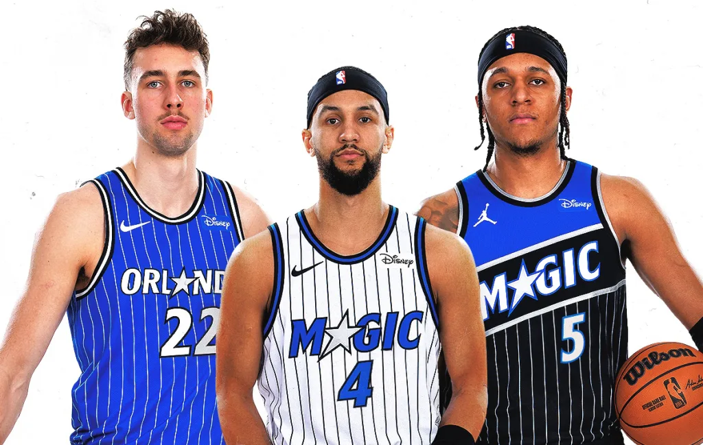
The rebrand process began in 2021 with multiple agencies and many early concepts that didn’t resonate. There were 14 different logos, each with multiple variations. Out of more than 30 uniform designs, the team narrowed it down to the final three, in blue, white, and black. All of them have pinstripes and retro-inspired trim, and the new “Magic” and “Orlando” wordmarks swap out the letter A for a star designed to look like it’s in motion. One of the jerseys features Chicago Bulls great Michael Jordan’s “Jumpman” logo (Jordan Brand partnered with the NBA in 2020), and all feature the Disney logo for the team’s uniform sponsor.
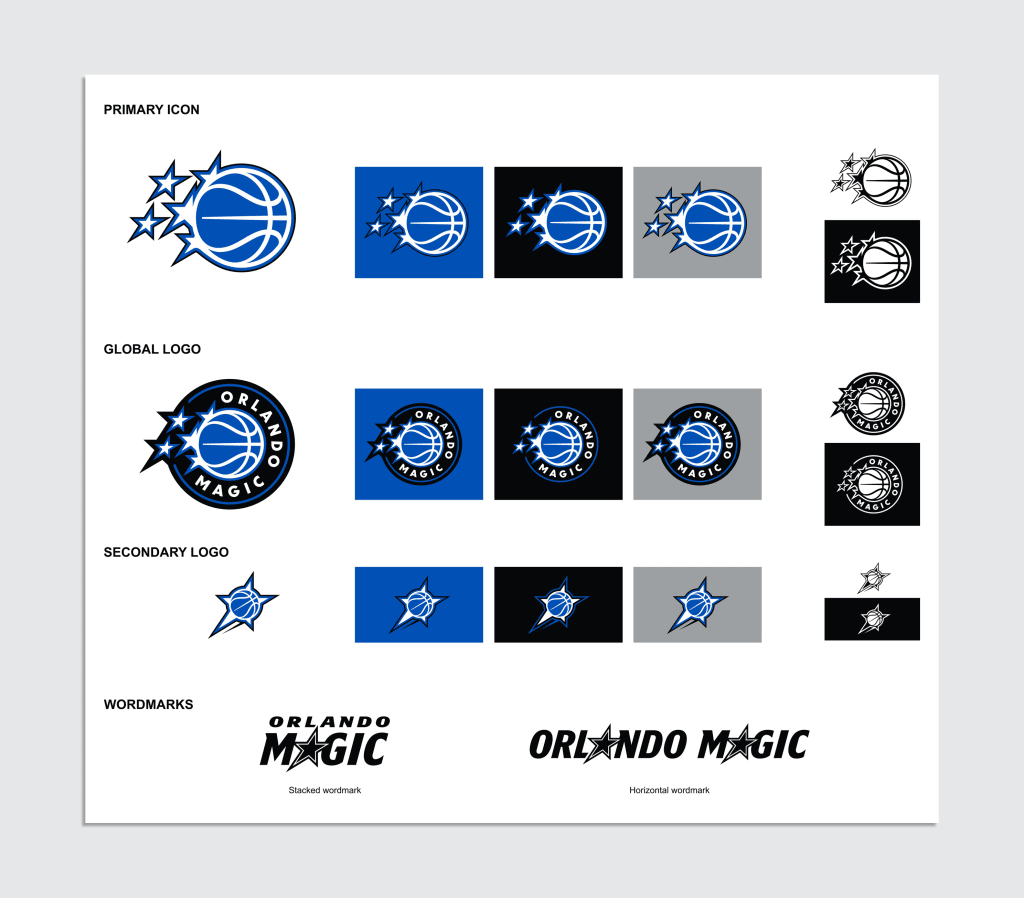 [Image: Orlando Magic]
Wilkes said the timing of the new logo and uniforms is the result of a pivotal moment in franchise history, but the final designs were submitted to the NBA and Nike in 2023, to give you an idea of the multiyear process involved in rebranding a professional team. That’s a long lead time, but by building a new brand informed by fan feedback and team history, the Magic ensured its new era has a visual identity that feels both classic and fashion-forward and aims to stand the test of time.
The extended deadline for Fast Company’s Brands That Matter Awards is this Friday, June 6, at 11:59 p.m. PT. Apply today.


 English (US) ·