
KEY FACTS
June 21 is Show Your Stripes Day — a time to spread awareness about climate change using the iconic “warming stripes” graphics showing temperature trends over the last 100+ years.
Download and share warming stripes for 195 U.S. cities, 49 states, the country, and the globe.
Each colored stripe represents the annual average temperature relative to a long-term average.
Red stripes are years that were hotter than average; blue stripes are years that were cooler.
The strong red shift reflects rapid warming in recent decades.
This Climate Matters analysis is based on open-access data from the National Oceanic and Atmospheric Administration (NOAA). See Methodology for details.
Show Your Stripes on June 21
Show Your Stripes Day is a global campaign to spread awareness about climate change using “warming stripes” graphics. This iconic climate data visualization will appear on landmarks, sports jerseys, cars, and more as the world unites to show their stripes on June 21.
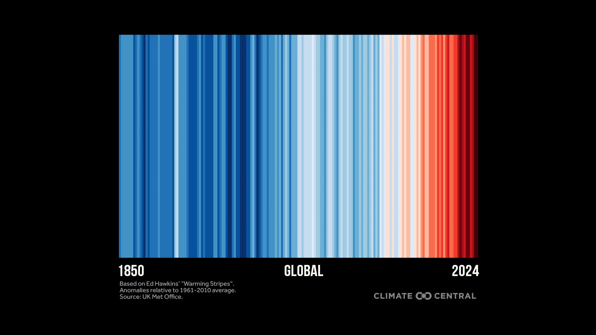 Click the downloadable graphic: Global Warming Stripes 1850 to 2024
Global warming stripes
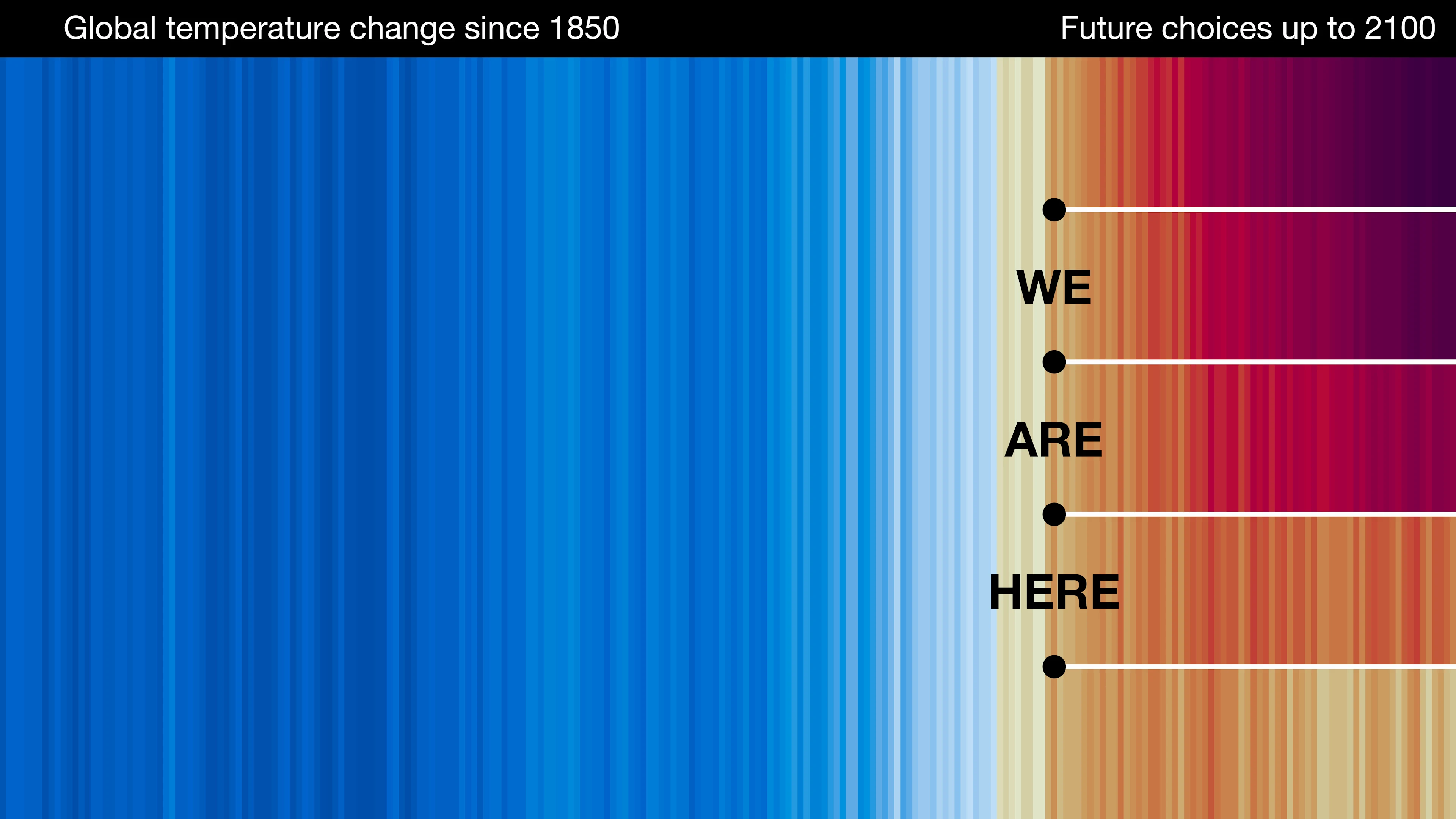
The global warming stripes, created by Professor Ed Hawkins, are a visual representation of the long-term rise in global temperatures due to human-caused climate change.
Each stripe represents the global temperature averaged over one year, from 1850 to 2024. Red stripes are years that were hotter than the 1961-2010 average; blue stripes are years that were cooler.
The global warming stripes graphic shows a rapid shift from blue to red stripes in recent decades as heat-trapping pollution has warmed the planet.
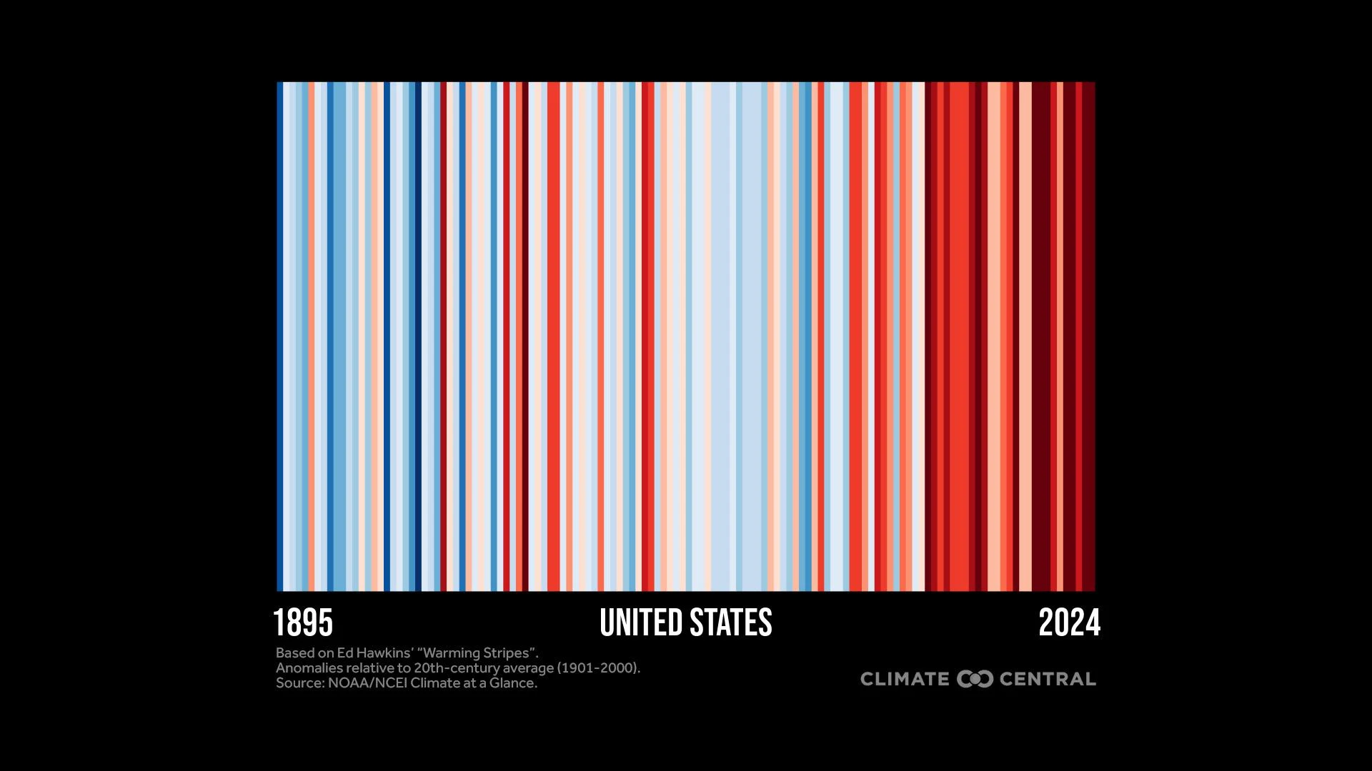 Click the downloadable graphic: U.S. Warming Stripes through 2024
U.S. warming stripes
Climate Central analyzed historical temperature data through 2024 to produce warming stripes graphics for 195 U.S. cities, 49 states (excluding Hawaii), and the contiguous U.S.
Each graphic shows 100+ years of temperature change relative to the long-term average at the city, state, or national level. See Methodology below for details.
Visit showyourstripes.info/map to find warming stripes for hundreds of cities across the globe.
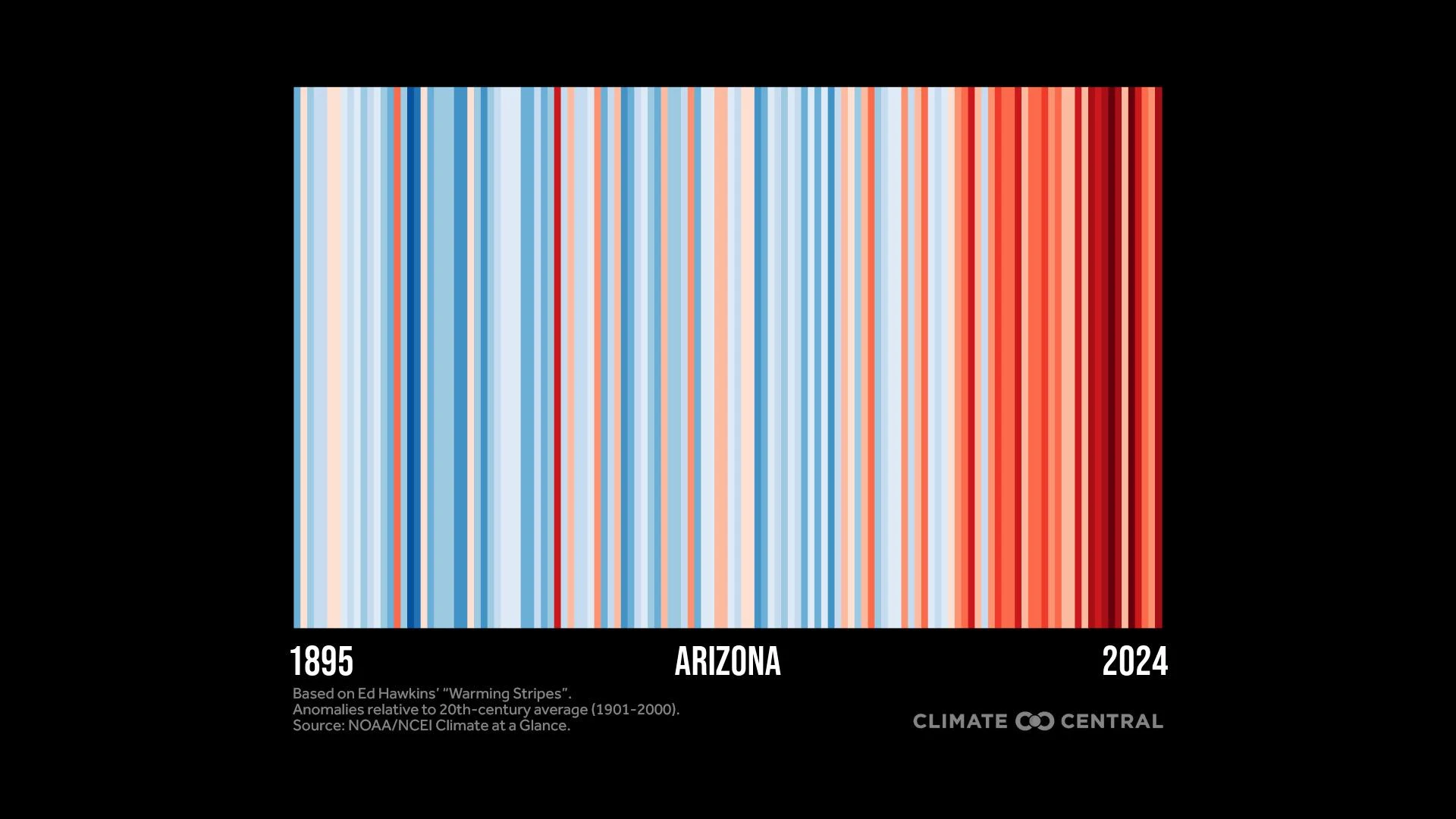 Click the downloadable graphic: State Warming Stripes through 2024
 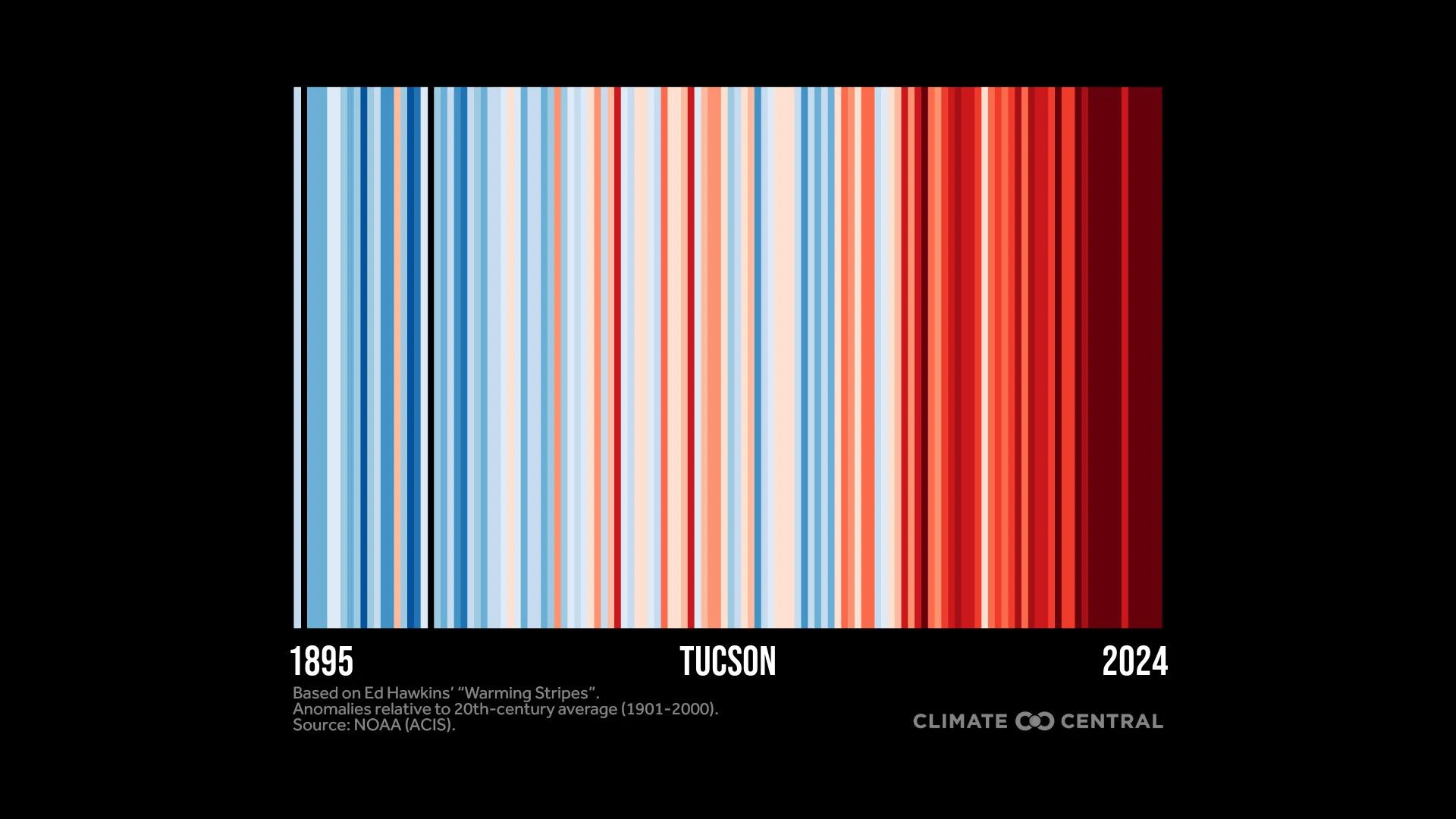 Click the downloadable graphic: City Warming Stripes through 2024
Most locations show a strong warming trend, especially in fast-warming regions like the Southwest, Northeast, and Alaska.
In 2024, the following cities were warmest relative to the 20th century average: Phoenix, Ariz. (7.0°F above average); Fargo, N.D. (6.6°F); Burlington, Vt. (6.4°); and Reno, Nev. (6.2°F).
Ways to #ShowYourStripes
Here are some ways to #ShowYourStripes on June 21 — or any day — to spark climate conversations:
Download your stripes. Climate Central provides free warming stripes graphics for 195 U.S. cities, 49 states, the country, and the globe.
Share your stripes. Post the graphic on social media (use #ShowYourStripes and tag @ClimateCentral). Set it as your profile picture, drop it in your friends and family group chat, or add it to your workplace Slack or Teams.
Get inspired. Visit Climate Central’s Show Up for Stripes Day page for examples of warming stripes in action.
Explore Climate Central’s resources for hundreds of graphics and articles that explain the local impacts of global climate change and solutions for a safer future.
Warming stripes: sparking conversations and action
Global temperatures shattered records in 2023 and 2024 by such wide margins that it’s forcing an expansion of the warming stripes color scale earlier than expected.
These recent record-breaking global temperatures — both on the land and in the ocean — have pushed the planet even closer to the internationally-agreed goal to limit warming to 1.5°C (2.7°F) or well below 2°C (3.6°C) above pre-industrial levels.
Exceeding 1.5°C in a single year, which first occurred in 2024, does not mean we’ve breached the 1.5°C limit set by the Paris Agreement. That limit, which represents a long-term global temperature anomaly averaged over at least 20 years, will be reached in the early 2030s if current rates of warming continue.
Well-established science shows that warming beyond this threshold will result in increasingly frequent and intense extreme weather events, and increasingly disruptive impacts on health, nature, crops, and economies around the globe.
This underscores the urgent need to turn climate conversations — sparked by warming stripes — into climate action.
Past and future warming stripes
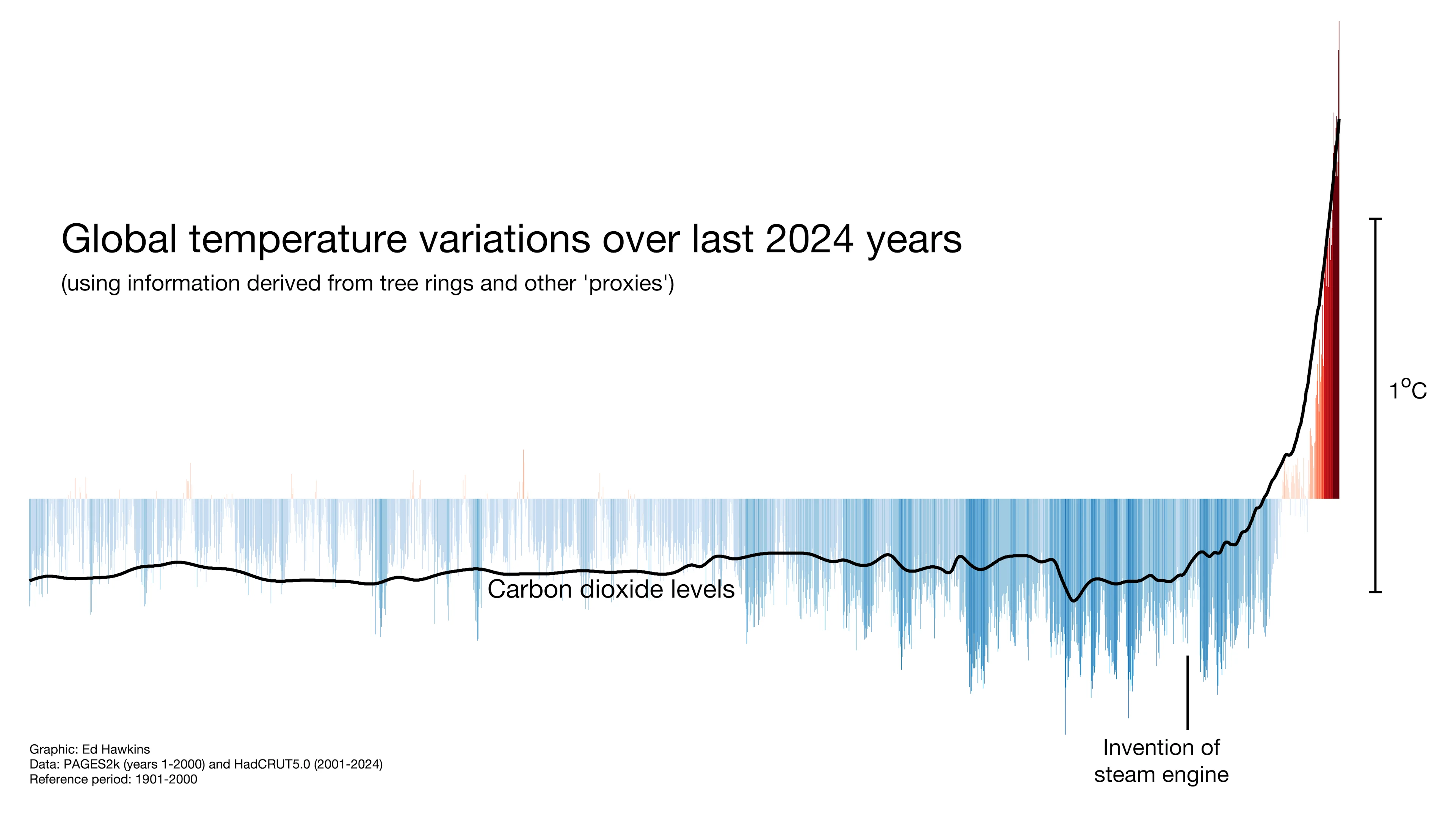
Warming stripes make it clear that current temperatures are the warmest on record. And stripes going back 2,024 years using paleoclimate data show the unprecedented pace and scale of modern climate change compared to fluctuations over millennia.
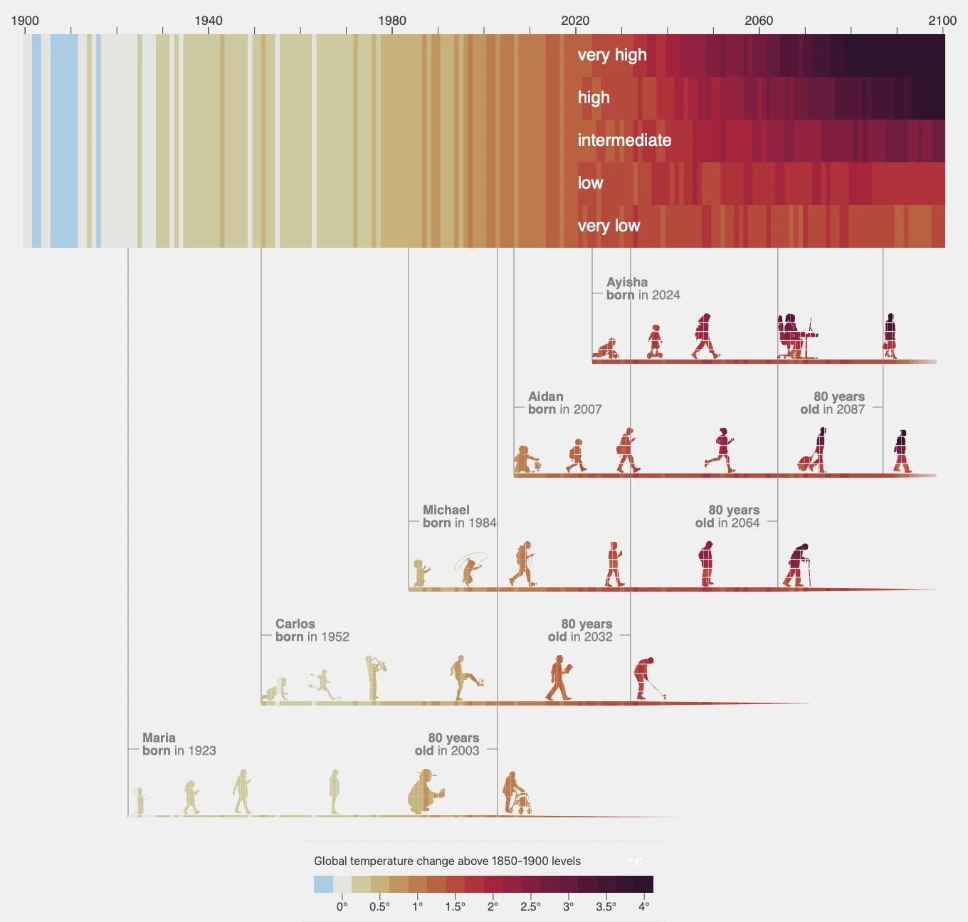
These graphics can also be used to show how our actions today will determine what color stripes younger generations will live through this century as warming continues.
Climate Legacies, developed by NASA scientists and based on a recent IPCC graphic, illustrates how different generations experience past and future warming during their lifetimes. Visit the site to create, download, and share your own warming stripes timeline based on your birth year.
Warming across generations
Climate Central recently analyzed how much warming younger generations could experience during their lifetimes if carbon pollution either continues, or is cut rapidly.
The analysis shows that younger generations (Millennials, Gen Z, and Gen Alpha) across the U.S. could experience between 6 to 7°F of warming over their lifetimes if high levels of emissions continue. These levels of warming would bring rapid change and more extreme events such as heat waves.
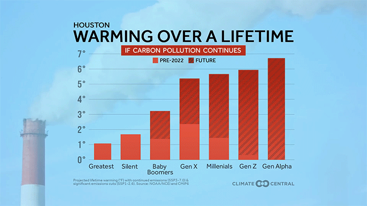 Click the downloadable graphic: Warming Across Generations
But the same Climate Central analysis also shows the powerful effects of the choices we make now.
The data show that keeping global warming under 2°C (3.6°F) with rapid cuts in carbon pollution would set younger generations on a radically different path — toward a far safer future with less warming and fewer risky extreme events.
Solutions for a cooler, safer future
The tools we need to choose this cooler, safer future are already available.
Talking about climate change is one step. And warming stripes are a great climate conversation starter.
Most Americans (63%) are concerned about climate change. But they also underestimate their neighbors’ climate concern. These misperceptions can create barriers to talking about climate change with our neighbors. But research suggests that communicating about the human causes of climate change increases public awareness and engagement.
Along with communication, various approaches are already reducing planet-warming pollution around the globe and in the U.S.
The U.S. produced a record amount of electricity from solar and wind in 2024 — enough to power the equivalent of more than 70 million average American homes.
Heat-trapping emissions have already decreased in most U.S. states since 2005, though not nearly fast enough to align with global ambition to keep global warming under 2°C (3.6°F).
The solutions needed to accelerate these recent trends by cutting carbon from transportation, electricity, agriculture, and industry already exist — and have the potential to expand across the country.
At the same time, U.S. clean energy investment has never been higher. These investments are flowing to the manufacture and deployment of emissions-reducing technologies in every U.S. state.
The science is clear: maintaining and accelerating this momentum is essential for a cooler, safer future.
FIND EXPERTS
Submit a request to SciLine from the American Association for the Advancement of Science or to the Climate Data Concierge from Columbia University. These free services rapidly connect journalists to relevant scientific experts.
Browse maps of climate experts and services at regional NOAA, USDA, and Department of the Interior offices.
Explore databases such as 500 Women Scientists, BIPOC Climate and Energy Justice PhDs, and Diverse Sources to find and amplify diverse expert voices.
Reach out to your State Climate Office or the nearest Land-Grant University to connect with scientists, educators, and extension staff in your local area.
METHODOLOGY
The global warming stripes design was developed by Ed Hawkins, Professor of Climate Science at the University of Reading, as described here and in Hawkins et al. (2025).
Within this brief, warming stripes for the globe, the contiguous U.S., 49 states (excluding Hawaii due to insufficient data), and 195 cities are based on annual average temperature anomalies. For cities with data beginning in 1901 or before, anomalies are relative to the 20th century (1901-2000) average. For a subset of 42 cities, whose period of record begins after 1901, annual temperature anomalies are relative to the oldest available 100-year average for each city. Stations with less than 100 years of data were excluded. Anomalies for the U.S. and all states except Alaska are relative to the 20th century average. The baseline for each location (whether the 20th century average or a custom 100-year period) is indicated in the footnote on each warming stripes graphic.
Data for the global warming stripes graphic (1850-2024) is from the UK Met Office; the graphic was accessed directly from showyourstripes.info, courtesy of Ed Hawkins, National Centre for Atmospheric Science, University of Reading.
Data for stripes graphics for the contiguous U.S., and U.S. states are from NOAA’s NCEI Climate at a Glance. Data for U.S. cities are based on weather station data from the Applied Climate Information System, which is developed, maintained, and operated by NOAA’s Regional Climate Centers.
For each location (contiguous U.S., states, cities), the average temperature over the baseline period (either 20th century or custom 100-year period) is set as the boundary between blue and red color scales. The full color scale spans +/- 2.6 standard deviations of each location’s annual average temperature anomalies relative to the baseline period (either 20th century or custom 100-year period). The full color scale uses 16 colors: the eight most saturated classes of the nine-class sequential blue and red color scales.


 English (US) ·